
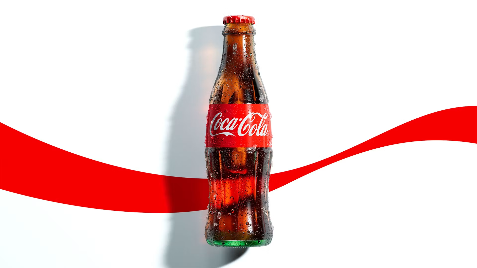

Coca‑Cola has unveiled a new global visual system that seeks not to reinvent anything, but to sharpen the elements that already define the planet’s most recognizable brand. The new identity, developed by JKR for over two hundred markets, introduces no revolutions; instead, it refines, focuses, and streamlines. It is an act of cultural maintenance rather than innovation.
At the heart of the project lies a deliberate return to the symbols that built the Coca‑Cola image: red and white, Spencerian script, the Dynamic Ribbon, and the Arden Square. These are elements that require no explanation—only calibration. The result is a system spanning packaging, retail environments, equipment, and digital experiences, aiming for global consistency without succumbing to rigidity.
The Zero Sugar version receives a parallel treatment: bolder typography, a more prominent black ribbon, and details that make the variant instantly recognizable without compromising its essence. It is a process of subtraction, not addition.
Tosh Hall, JKR’s Global Chief Creative Officer, describes it as an exercise in amplifying the brand’s history. Rather than starting from scratch, the work builds upon a 140-year archive shaped by artists, designers, and agencies that defined entire eras of visual communication. The goal is not to surpass that heritage but to ready it for the future—identifying the most recognizable version of Coca‑Cola and turning up the volume.
Rapha Abreu, Global Vice President of Design, emphasizes a key point: consistency does not mean uniformity. The system is conceived as an “operating system” rather than a set of rigid rules. Markets can tailor photography, messaging, collaborations, and cultural activations. The identity remains robust without stifling local nuances. It is the classic tension between the global and the local, managed here with rare maturity. Alongside the visual elements, Coca‑Cola is introducing an immersive Brand Center and AI-driven Design Intelligence tools, designed to ensure the system is applied correctly at a scale unmatched by any other brand in the beverage industry. Technology is not merely an accessory; it is half the project.
The work is the result of an extensive collaboration. The Superultrarare developed the global packaging, Brody Associates created a proprietary typeface, Forpeople and Monks built the Brand Center, and Adobe developed the governance tools, while photographers such as Guy Aroch, Anna Palma, and Martin Wonnacott defined new visual standards. It is a constellation of expertise working as a single creative workshop.
The result is an identity that seeks not to surprise, but to consolidate. It is an act of care for a brand that does not need to be reinvented, but simply kept alive, legible, and contemporary—a statement of continuity rather than change.